
We’ve all been there: You find the perfect pair of shoes, you’re ready to buy, and then… the checkout process asks for your life story, your blood type, and a password with seventeen special characters.
Click. Close tab. Gone.
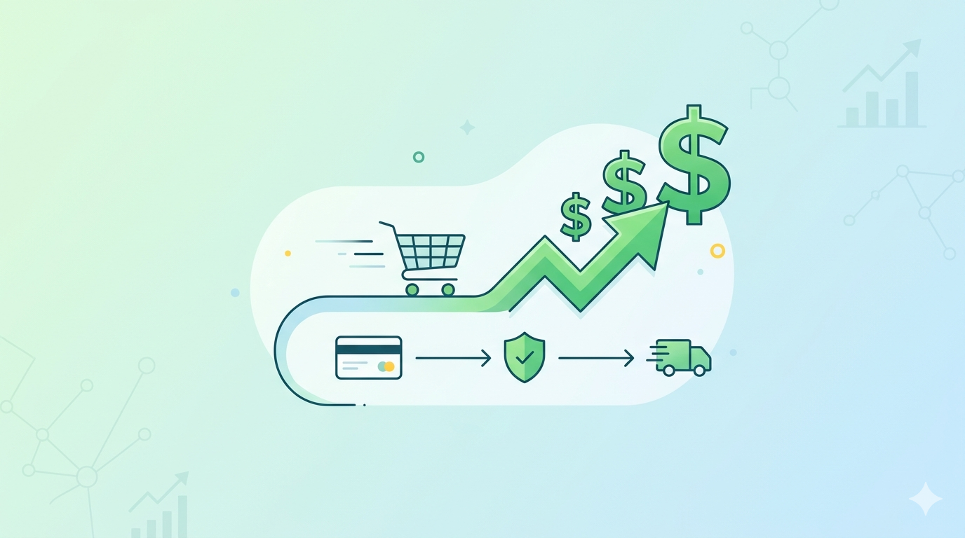
In the world of e-commerce, a “pretty” website is great, but a seamless checkout is what actually pays the bills. Design isn’t just an aesthetic choice; it’s a financial lever. If you want to prove to stakeholders that investing in UX (User Experience) isn’t just a “nice-to-have” but a revenue engine, you need to speak the language of ROI (Return on Investment).
The Cost of Friction: Why Every Second Matters
Before we calculate the gains, we have to look at the losses. Research consistently shows that the average cart abandonment rate hovers around 70%. While some of that is just “window shopping,” a significant portion is due to “friction”—the digital equivalent of a long, messy line at a grocery store.
Common friction points include:
- Mandatory account creation.
- Hidden shipping costs revealed at the last second.
- Too many form fields.
- Lack of diverse payment options (Apple Pay, PayPal, etc.).
The ROI Formula for Checkout Design
Calculating the ROI of a design overhaul might seem like trying to nail jelly to a wall, but it actually boils down to a few key metrics. Here is the foundational math:
$$ROI = \frac{(\text{Gain from Investment} – \text{Cost of Investment})}{\text{Cost of Investment}} \times 100$$
To find your “Gain from Investment,” you need to track these three KPIs:
1. Conversion Rate Increase
This is the big one. If your current checkout converts at 3% and a redesign bumps it to 3.5%, that 0.5% jump can represent millions in annual revenue depending on your scale.
2. Reduced Cart Abandonment
By simplifying the flow, you decrease the number of users who drop off.
Pro Tip: Even a 1% reduction in abandonment can lead to a significant boost in the bottom line without spending an extra dime on marketing or acquisition.
3. Customer Lifetime Value (CLV)
A seamless experience brings people back. Frictionless checkouts foster trust. If the first purchase was easy, the second one is a “no-brainer.”
A Hypothetical ROI Snapshot
Let’s look at how the numbers play out for a mid-sized retailer:
| Metric | Before Redesign | After Redesign | Impact |
| Monthly Visitors | 100,000 | 100,000 | – |
| Conversion Rate | 2.0% | 2.4% | +20% |
| Average Order Value (AOV) | $100 | $100 | – |
| Monthly Revenue | $200,000 | $240,000 | +$40,000 |
In this scenario, if the redesign cost $40,000 to implement, you’ve reached your break-even point in just one month. Every month after that is pure profit.
How to Build a “Seamless” Experience
If you’re ready to start capturing those lost dollars, focus on these high-impact design changes:
- Implement Guest Checkout: Don’t force a relationship on the first date. Let them buy first; ask them to create an account on the “Thank You” page.
- One-Page vs. Multi-Step: Minimize the number of clicks. If you use multiple steps, provide a clear progress bar so users know the end is in sight.
- Auto-Fill and Address Validation: Use APIs to suggest addresses as users type. It saves time and prevents shipping errors.
- Mobile-First Precision: Ensure buttons are “thumb-friendly” and the keypad switches to “numeric” for credit card fields automatically.
The Bottom Line
Design is often treated as a subjective expense, but in the checkout lane, it is a hard science. By removing friction, you aren’t just making a site look better—you are widening the pipe through which your revenue flows.
When you design for the user, the dollars tend to follow.